With
my results I found that Eau Claire North should not be worried about losing
their jobs. They absolutely should not be worried about not having the highest
test scores. Eau Claire North had an average test score higher than Eau Claire
Memorial. From what the data is showing us, we see that Eau Claire North had a
higher mean, median, mode, a smaller range and a smaller standard deviation.
That means that there average was higher and that there is less variation in
there test scores in comparison to Eau Claire Memorial. Eau Claire Memorial did
have a slightly higher max score than Eau Claire North, but in contrast Eau
Claire North's low score was higher than Memorials.
Reflection
Number 2

The
information that was collected for this report was number of organic goat farms
per county, and the number of goats that were in each county. Also I looked
into the differences from the mean, the percent each county contributed to the
total of goats and farms. The map to the left shows the number of organic farms
per county. Vernon count has the most farms. It is easy to see the distinct
pattern, the southwest corner of the state has consistently more than anywhere
else just as northern Wisconsin has a very minimal amount of organic farms. This
is because of the type of land that is in these areas. Northern Wisconsin is
not typically known for agriculture, there are big stands of timber and not much
prairie land.

The second map I have to display
shows the percent of organic farms by county from the total. Vernon County is
again the only county in the top percentage bracket. With the Jenks method of classification,
these maps look nearly identical. The map below illustrates the difference between
the mean and the actual number of organic farms.
Illustrated below is a map that shows the number of goats
as a percent of the total goat population per county. This map gives us a
better idea of where most of the goats are located.
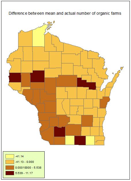 In step one of part two of the assignment, I calculated a
new column called the Difference from the average. This gave us an idea of what
counties were close to the mean and what counties either had more or less than
the data would have originally suggested. I would say the patterns when looking
at these maps simply shows us that the southern half of the state holds the
best chance for organic and goat farming.
I would place a farm somewhere in the central farmland area. There is good
woods cover, plenty of agriculture and you wouldn’t be competing with the goat
farmers in Vernon County. I think the map that showed the percentage of farms from
the total showed my angle the best. It showed that there are farms in the central
area, but the most are in the southwestern corner. I think that there is
somewhat of a lack of data here. I am not sure if they are only counting goats
that are on organic farms or all goats in general because there is a goat farm
near my house that has over fifty goats, but it says there isn’t even that many
goats in that county. So I would like to read about the methods for collecting
this data. The distribution of the organic farms is not very evenly distributed,
there is one county with 229 farms and another with 0. Then with a standard
deviation of 28.19 and a mean of 16, that county with 229 is an outlier. The
number of goats is a lot better as far as kurtosis goes. The distribution is
more even, with a mean of 33.5, and a standard deviation of 23.20, majority of
the counties fall within a reasonable variance from the mean. Then looking at
kurtosis, goats have a kurtosis of .53 compared to that of the organic farms
which was 46.5. The organic kurtosis is almost 100 times that of the goats. So this
shows that the goats have a very normal distribution, in contrast the organic
farms have a leptokurtic relationship because most of the number of farms per
county are around the mean, there is a long tail going towards the positive
end.
In step one of part two of the assignment, I calculated a
new column called the Difference from the average. This gave us an idea of what
counties were close to the mean and what counties either had more or less than
the data would have originally suggested. I would say the patterns when looking
at these maps simply shows us that the southern half of the state holds the
best chance for organic and goat farming.
I would place a farm somewhere in the central farmland area. There is good
woods cover, plenty of agriculture and you wouldn’t be competing with the goat
farmers in Vernon County. I think the map that showed the percentage of farms from
the total showed my angle the best. It showed that there are farms in the central
area, but the most are in the southwestern corner. I think that there is
somewhat of a lack of data here. I am not sure if they are only counting goats
that are on organic farms or all goats in general because there is a goat farm
near my house that has over fifty goats, but it says there isn’t even that many
goats in that county. So I would like to read about the methods for collecting
this data. The distribution of the organic farms is not very evenly distributed,
there is one county with 229 farms and another with 0. Then with a standard
deviation of 28.19 and a mean of 16, that county with 229 is an outlier. The
number of goats is a lot better as far as kurtosis goes. The distribution is
more even, with a mean of 33.5, and a standard deviation of 23.20, majority of
the counties fall within a reasonable variance from the mean. Then looking at
kurtosis, goats have a kurtosis of .53 compared to that of the organic farms
which was 46.5. The organic kurtosis is almost 100 times that of the goats. So this
shows that the goats have a very normal distribution, in contrast the organic
farms have a leptokurtic relationship because most of the number of farms per
county are around the mean, there is a long tail going towards the positive
end. 